User Research - Legal UX - Clear Language - Prototype - UI Design - User Tests -
Natural language search engine
2022
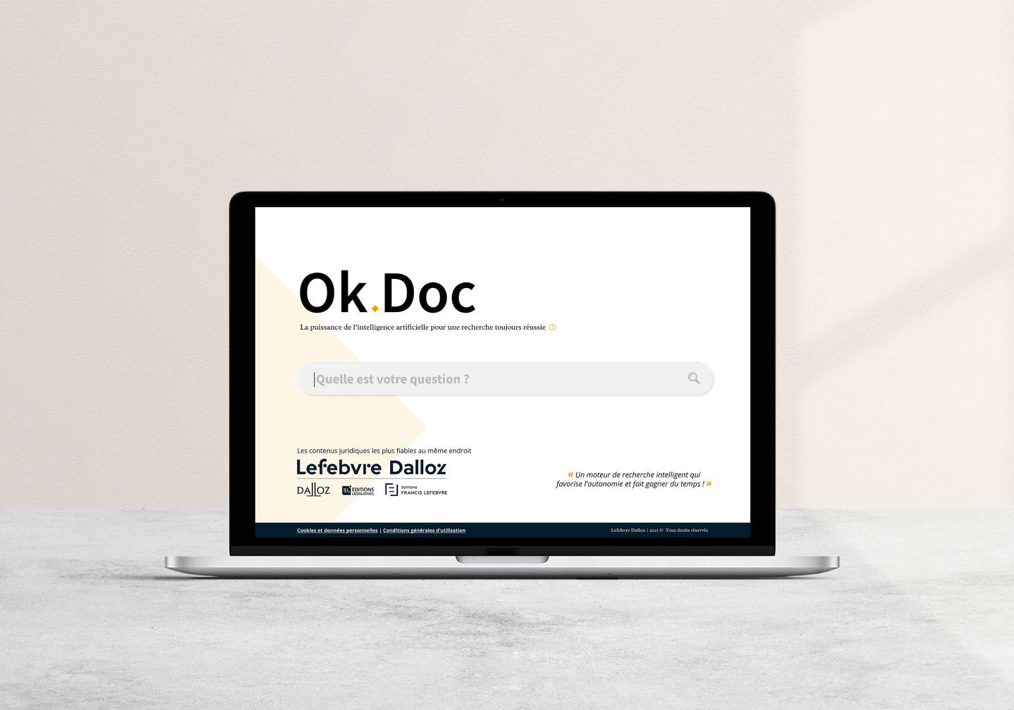
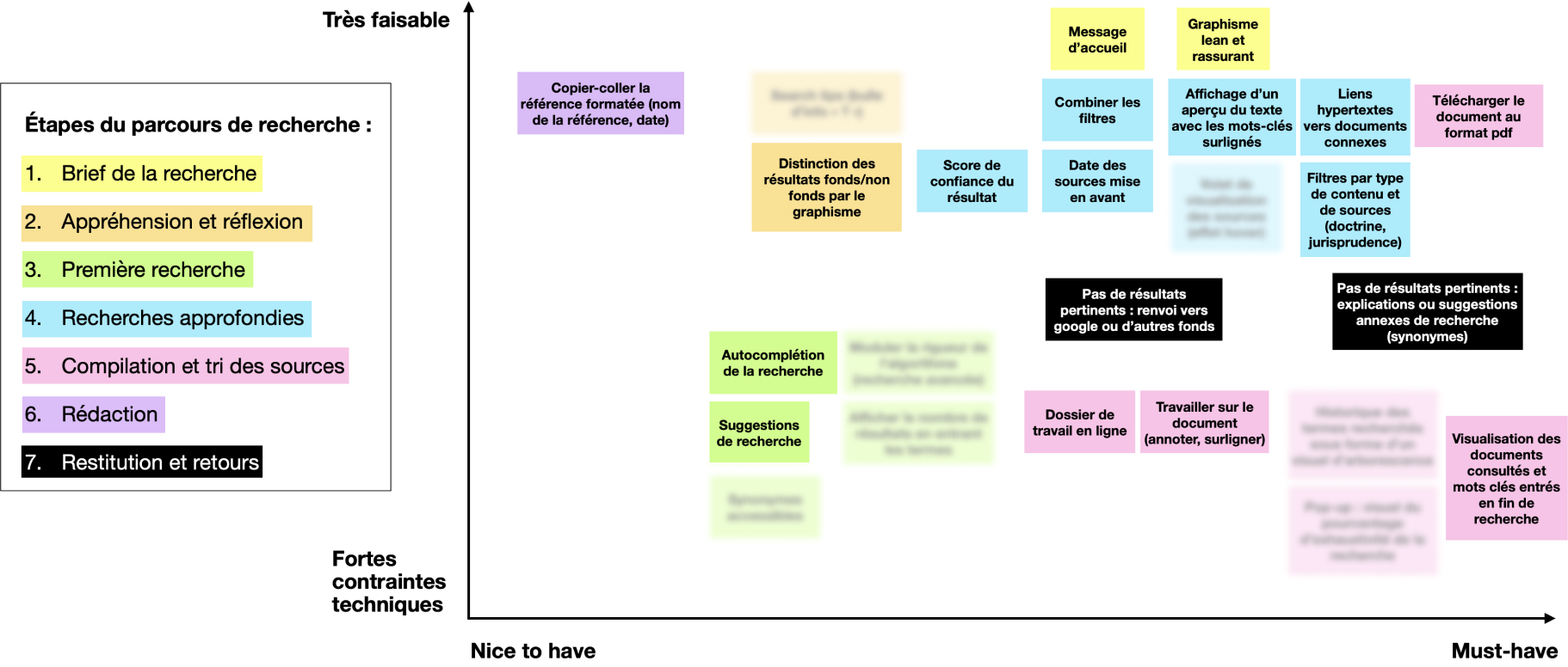
The R&D department of the legal publisher Lefebvre-Dalloz asked us for a challenge like we like: from a given technology (a natural language search algorithm based on a fast and powerful artificial intelligence), create the most user-centered product! In other words, define the concept of the new product, its positioning, its functionalities and of course create the best possible user experience, focusing on the human and not on the tech. The goal? To make legal research a satisfying experience for users, both to counter the fear of lawyers of missing a major element, and to allow non-lawyers (HR, accountants...) to easily find the answer to their basic questions.

To establish this benchmark, we chose to use the same search terms for each site: "intentional element price manipulation" and "intentional element market manipulation", on English-speaking sites, to simulate a typical legal search.
For each site, we followed a linear and identical search path: from the first contact with the search engine and the entry of the search terms to the page displaying the chosen result and the discovery of the functionalities and related tools proposed.

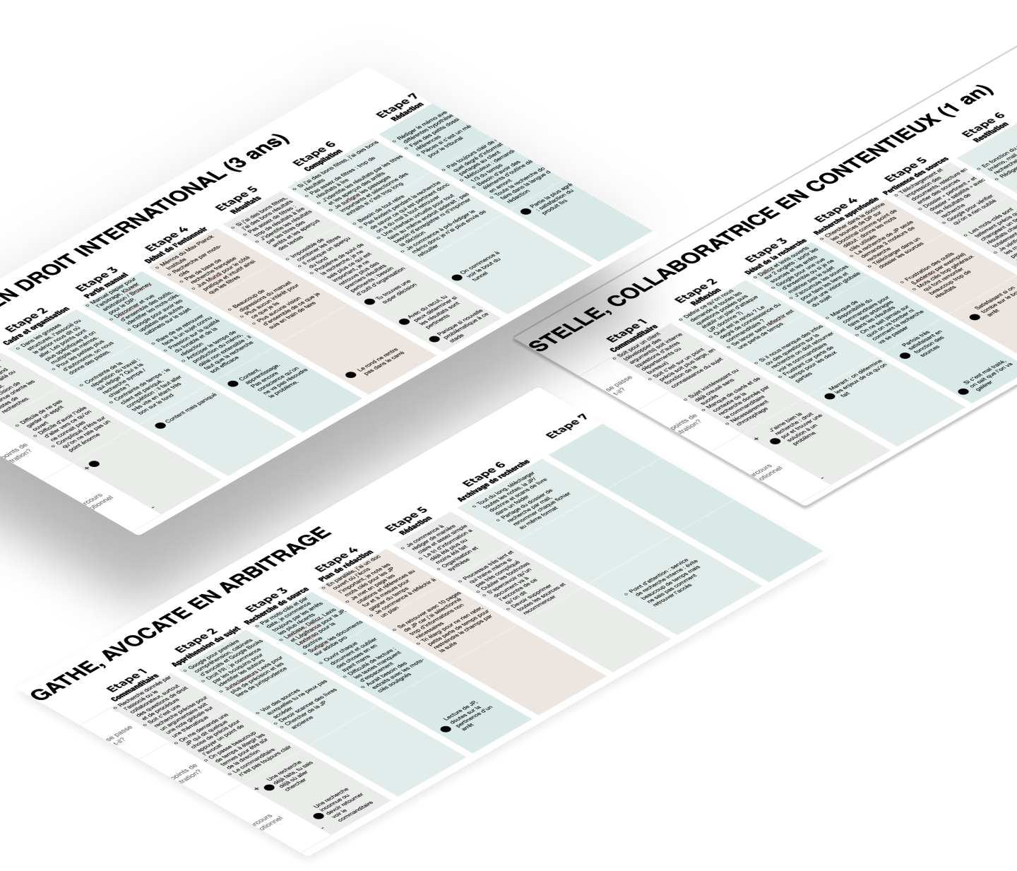
We interviewed a dozen lawyers, from the very junior to the senior and mid-level. What emerged is that whatever the seniority, what dominates is fear: fear of missing a source that the adversary will find and for the youngest it is the fear of missing information and of being caught for not having found it.

What do you do
when your
results of
research
are too
large ?

At what point
are you
totally
reassured about the
reliability and
the completeness of
your research?
We interviewed a dozen lawyers, from the very junior to the senior and mid-level. What emerged is that whatever the seniority, what dominates is fear: fear of missing a source that the adversary will find and for the youngest it is the fear of missing information and of being caught for not having found it.
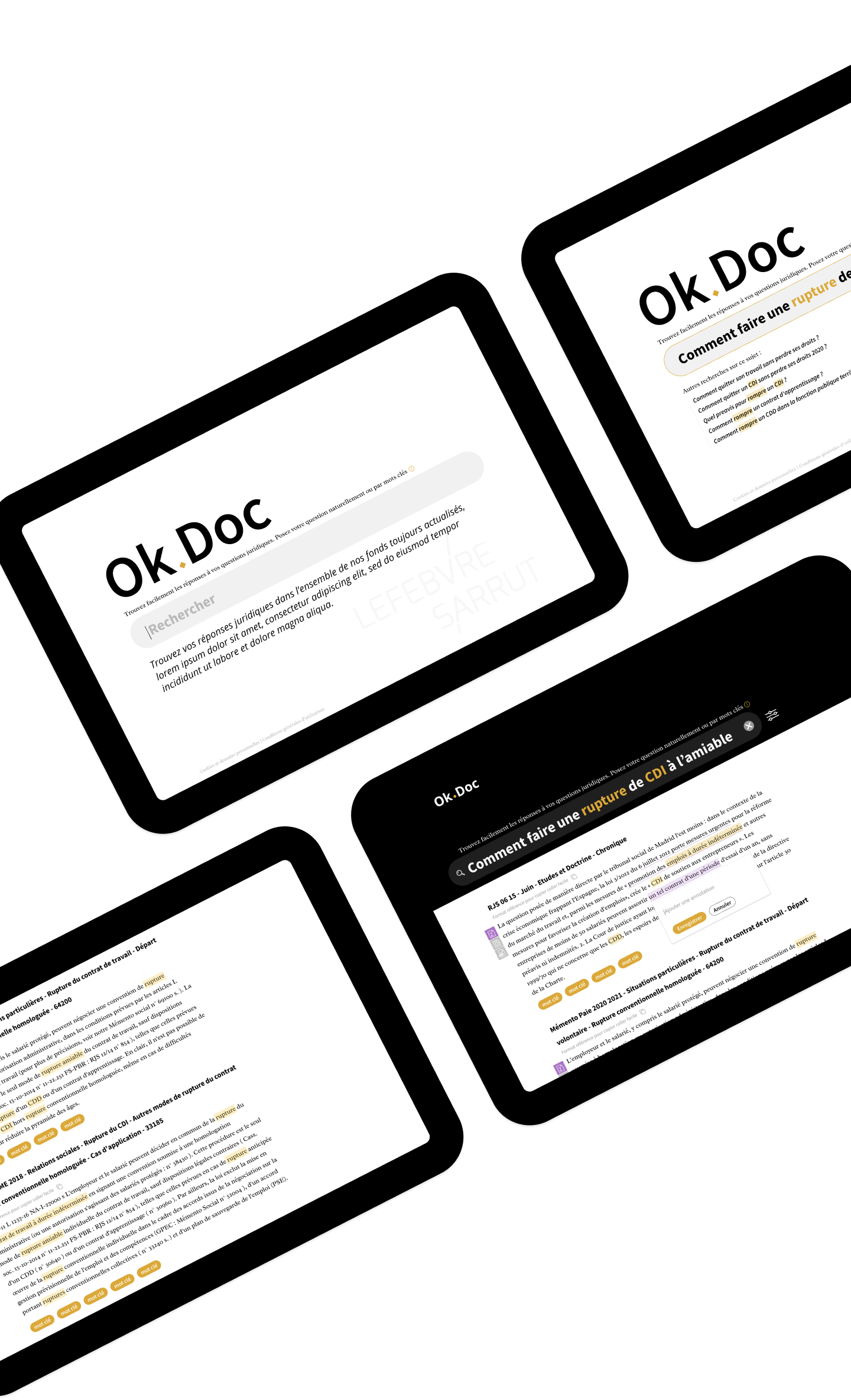
We tested the prototype with 125 users in 2 usage scenarios in order to measure acceptability (pre vs. post attitude, perceived usefulness, intention of use) and usability (effectiveness (% of success), efficiency: task completion time, errors, perceived complexity, understanding) and satisfaction.

Every month, receive our newsletters with our tips and latest projects