
With Mathilde da Rocha, PhD in cognitive neuroscience, we have developed a testing methodology adapted to legal documents based on internationally recognized standards.
Our Lab allows us to perform expert audits, user tests, online accessibility tests (taking into account color blindness for example) and usability tests.
We apply two methods: expert evaluation and user testing. Combined, these methods allow us to evaluate the quality of legal documents according to the user characteristics and their information needs, tasks, and environment.
›It consists of evaluating the object by
focusing on the experience of the
evaluators (without direct involvement)
›It allows the identification of potential
interaction problems
›It concludes with concrete
recommendations
Often used in addition to user testing because it is more cost-efficient,
this evaluation is done without users. We rely on internationally recognized criteria such as Scapin & Bastien (1997) and Nielsen's heuristic principles to evaluate the way users interact with legal documents, taking into account their individual biases.
› It consists of putting user sample in a situation of using of the object
› During the test, objective and subjective measures are collected
› The analyses allow confirming or refuting the initial hypotheses
We evaluate the accessibility of documents using readability tests such as Flesch, Gunning Fog, ARI, Coleman Liau, and SMOG. Beyond all of these acronyms, the method is fairly simple: we measure the level of education needed to understand a text on first reading, based on sentence length, sentence density, and word length.
Evaluate the design with users to improve solutions based on their feedback
Submit a prototype during development to minimize the risk that the document will not meet user or organizational requirements

Obtain data to define and prioritize areas for intervention
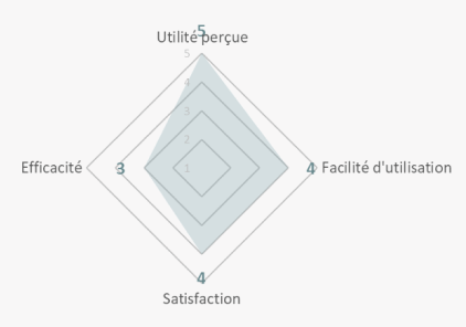
Test carried out for the CNIL within the framework of cookies settings.

Acceptability: 4 out of 5 children would like other apps to present this information
Comprehensibility: Average
The children were again very receptive to the content of the prototype and the issues involved. However, the analogy and link to the illustrations was questioned. The analogy with the crystal ball led to misunderstandings among the participants.
The ease of use is good (except for the home screen where the guidance can be improved). The illustrations contribute to the pleasure of using the prototype.
"It's good that they're taking a little bit of interest in us because it's not always safe"
"It's not clear enough because of the crystal ball, I don't understand why we're talking about this with cookies"
"I always say no to ads. So I click on 'refuse all.'"
Conclusion: the term "crystal ball" creates confusion, but the hero of the game and the illustrations promote acceptability.
Prototype to be abandoned, in favor of the n°2 of 15-17 (restructured video plus action buttons, without the quiz that did not work well).


Every month, receive our newsletters with our tips and latest projects